There is something like frosting a cake in painting the sides of stretched canvases.
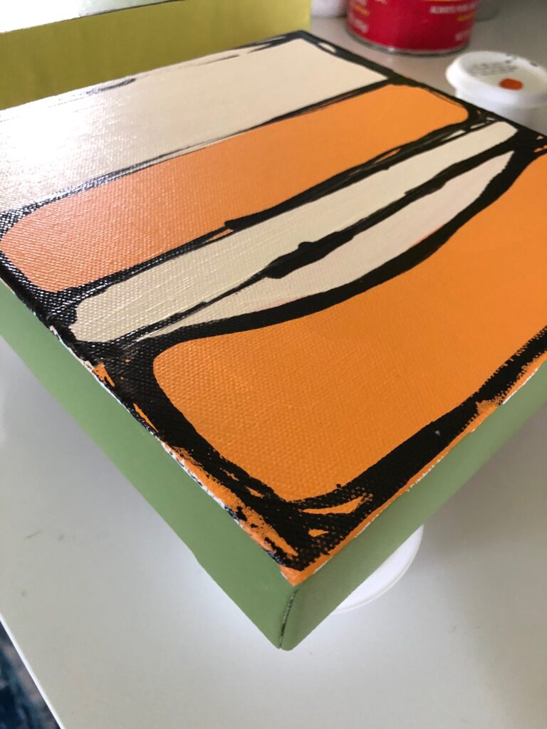
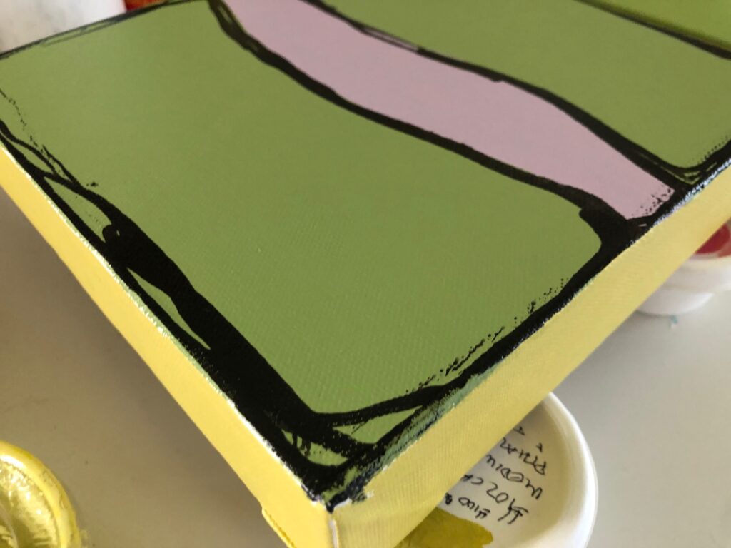
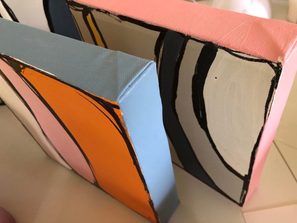
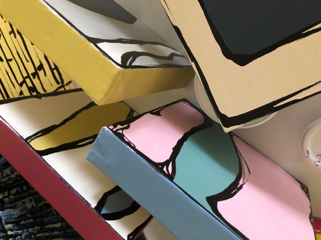
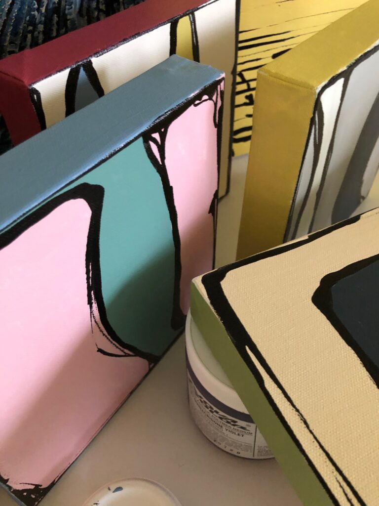
There is something like frosting a cake in painting the sides of stretched canvases.


Some days you struggle to draw your coffee cup, while other days you paint four paintings while also working a 9 hour day, warming up a lasagna for your kid, prepping breakfast for three, and taking care of your post-surgical dog and her rambunctious roommate. I don’t know why that is. But it is.
I started here:
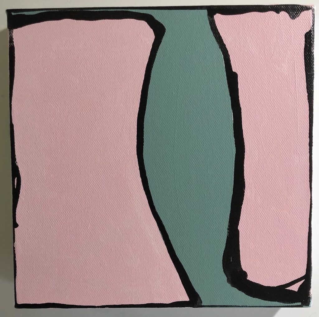
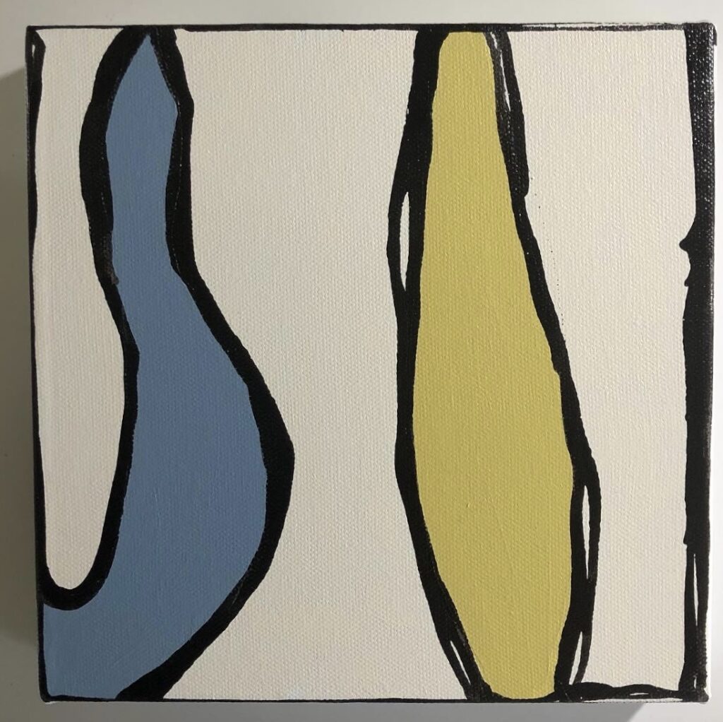
And then I dialed back the color and went here:
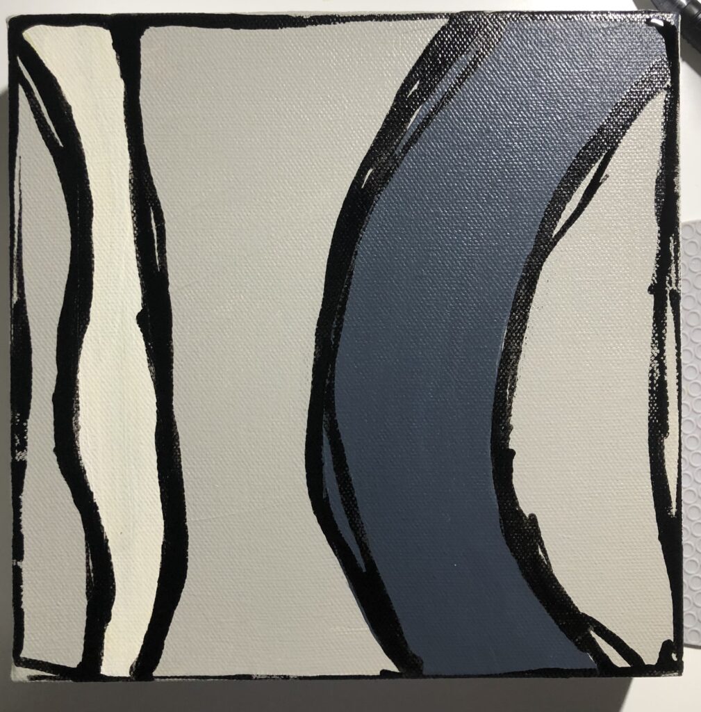
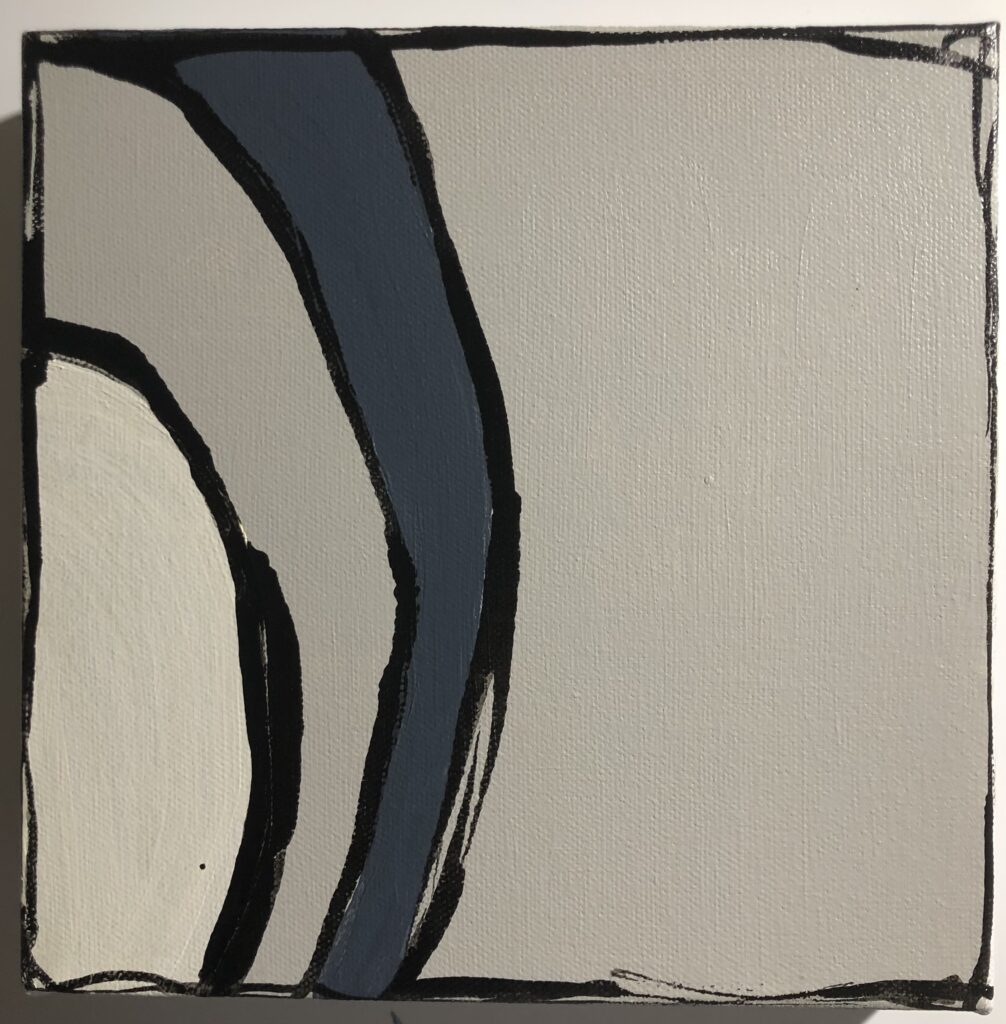
And that’s what came out of today.
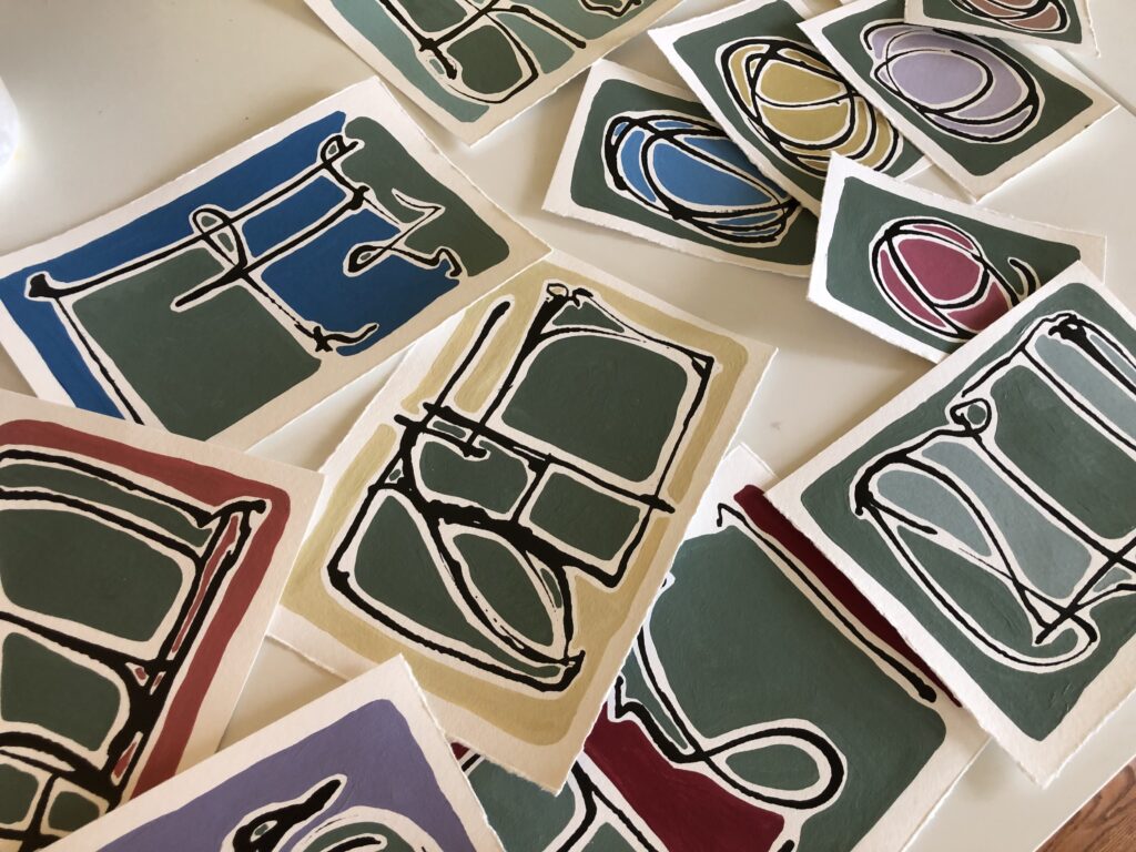
This series has been developing for years, since at least 2019, when I did a series of cards on watercolor paper first, to test the lines, the impact, and to work with different color palettes. I’d show them to you, but I can’t find them at the moment.
After my color cards, I started with two very large painting on rolled watercolor paper, one in Paris pink and grey. And then another with larger spaces, less rounded, and a darker more New York cement color to accompany the pink. Both of these are large-sized works.
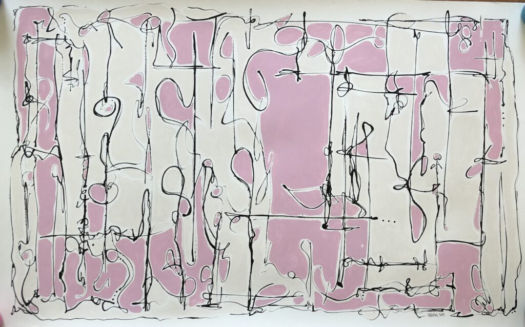
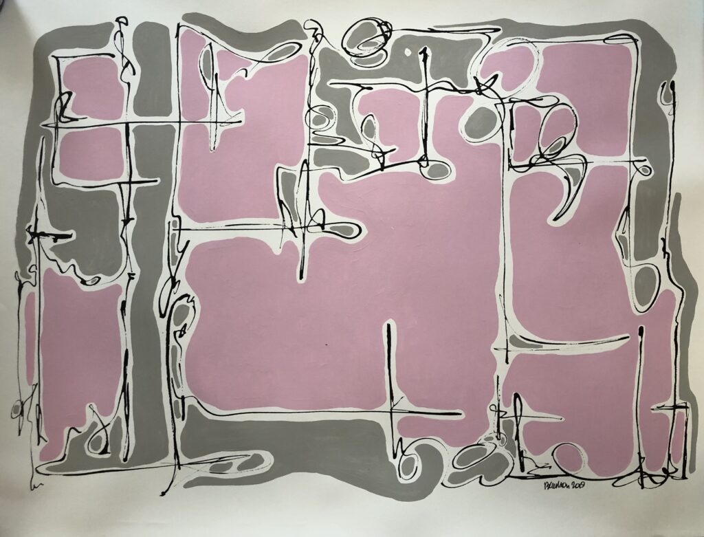
After a day spent at museums throughout D.C., and thinking about Picasso and his contemporaries and their color palettes, which were not at all like my usual, I wanted to come back and experiment. Could what I had been doing work if I went another way. with colors? And then I came up with this, also oversized and on watercolor paper:
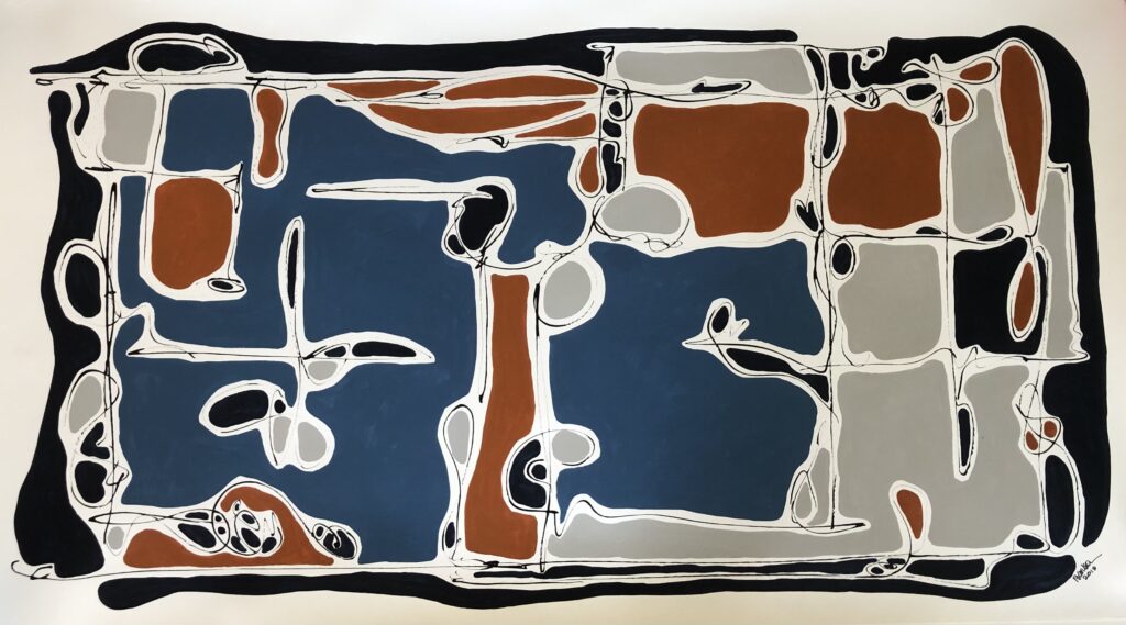
It was oddly satisfying to go a different more mid-century modern way with color. But I rolled them all up and put them up on the shelf. I wanted to do other things for a while, which I did, but I came back, three years later. I thought I might.
First I decided to do one based on the pink and cream one, but on canvas. I painted it on a roll of canvas, not stretched, so it won’t photograph well as is. The canvas has been rolled and is wavy and uneven at the moment. You’ll have to imagine that one, but it’s similar, and I enjoyed working on canvas.
It got me back into that frame of mind, so I cut up some paper and started making more color cards, to see where I might go with color and line this time:
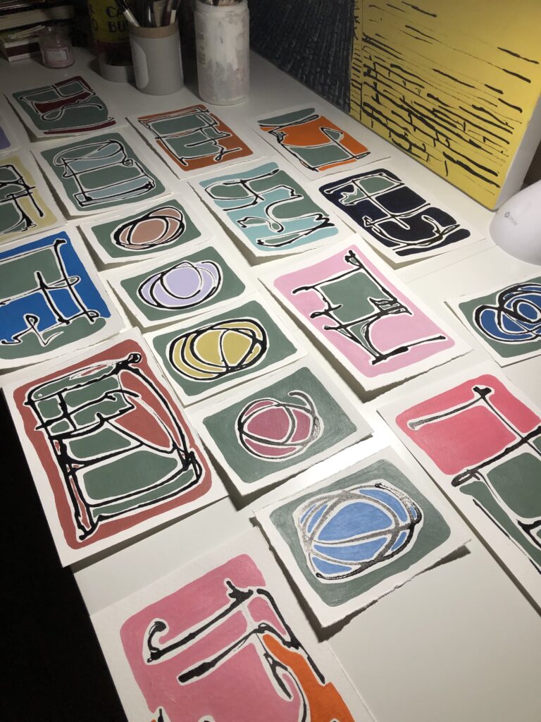
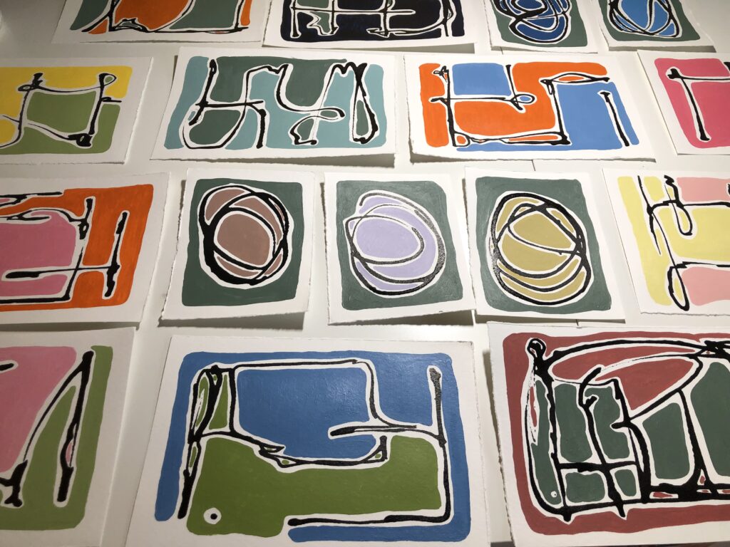
Then I painted 24 X 18 canvases, four of them, using a mid-century modern palette. The colors were those of kitchens, toys, powders and perfume packaging, the graphics and colors of advertising, album covers, the shapes of electronics, and other scenes and ephemera of my 1960s. I got so into thinking about the things on my grandmothers’ dresser tops, and the clothes I wore (those sunflower dresses, everything with daisies, and the Easter plaid suits with wide-legged pants and white go-go boots and patent leather shoes)
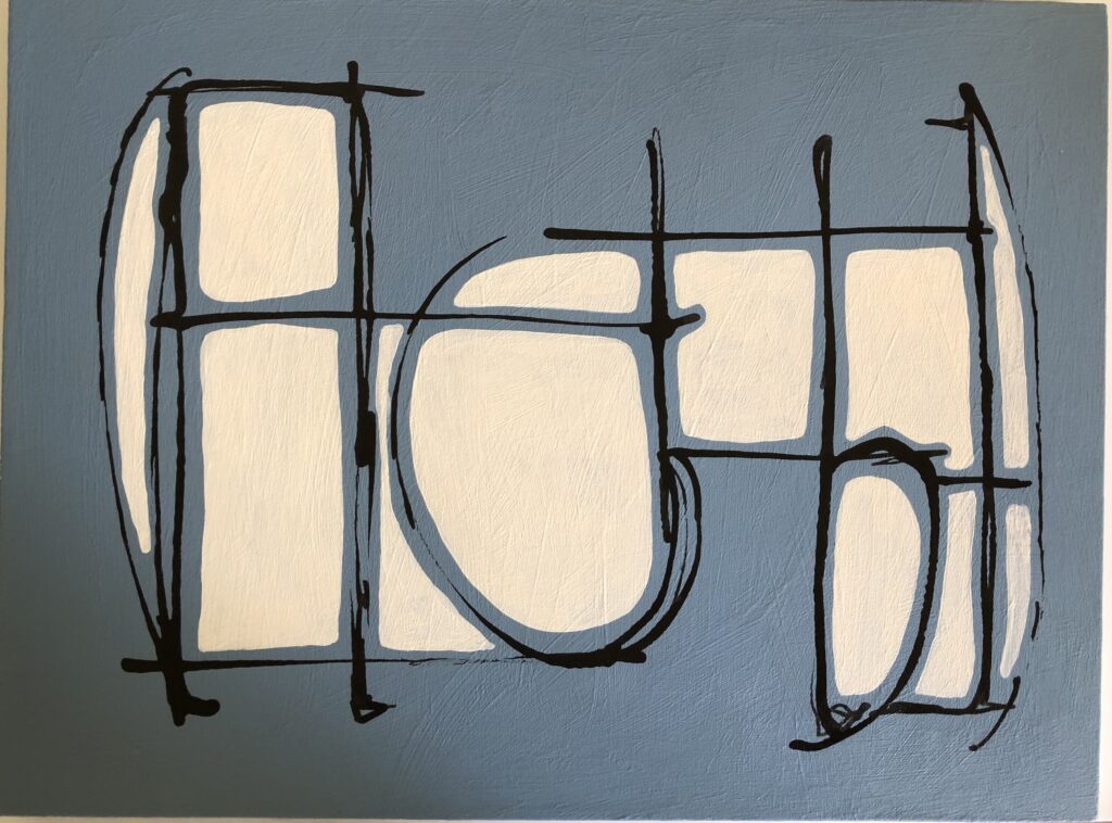
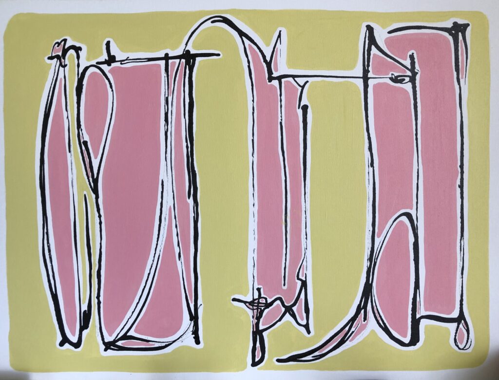
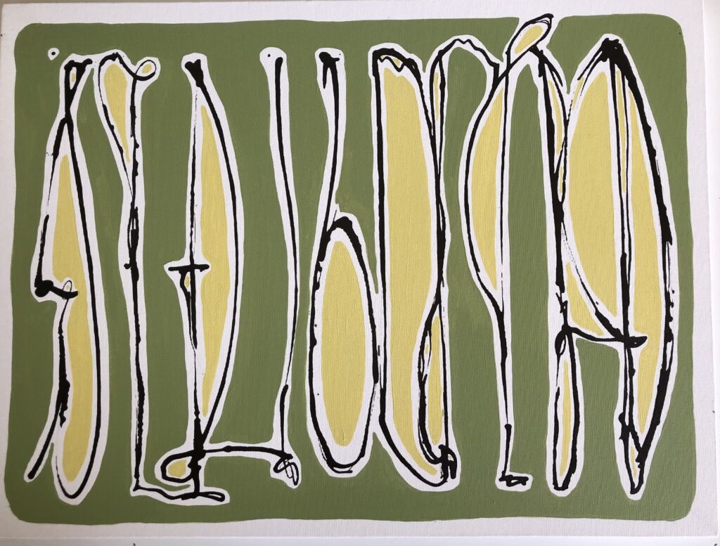
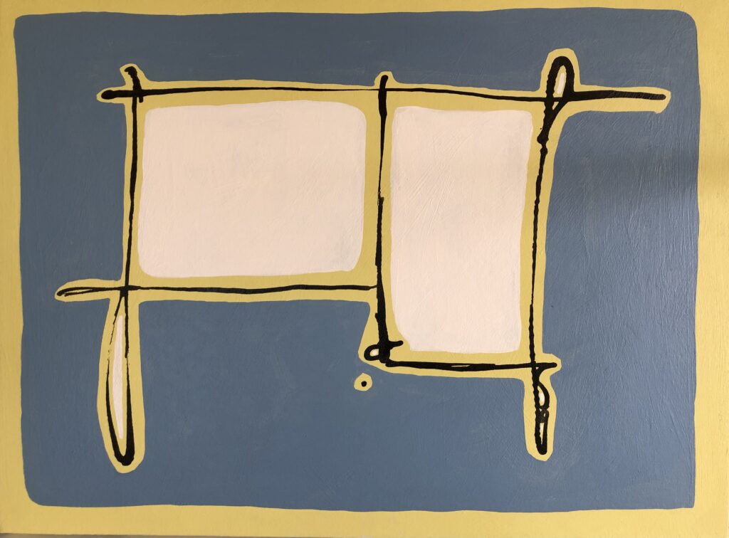
I wasn’t done with the shapes yet, and I made an additional ten smaller 8″ X 8″ canvases, this time with a color scheme that included painting the sides in a range of colors to compliment or contrast with the face of the paintings — like small frosted cakes.
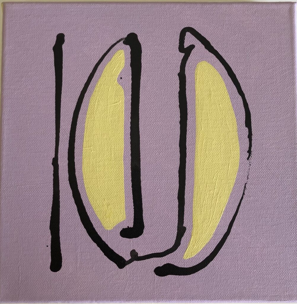
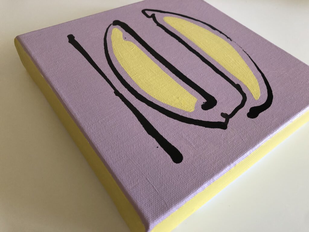
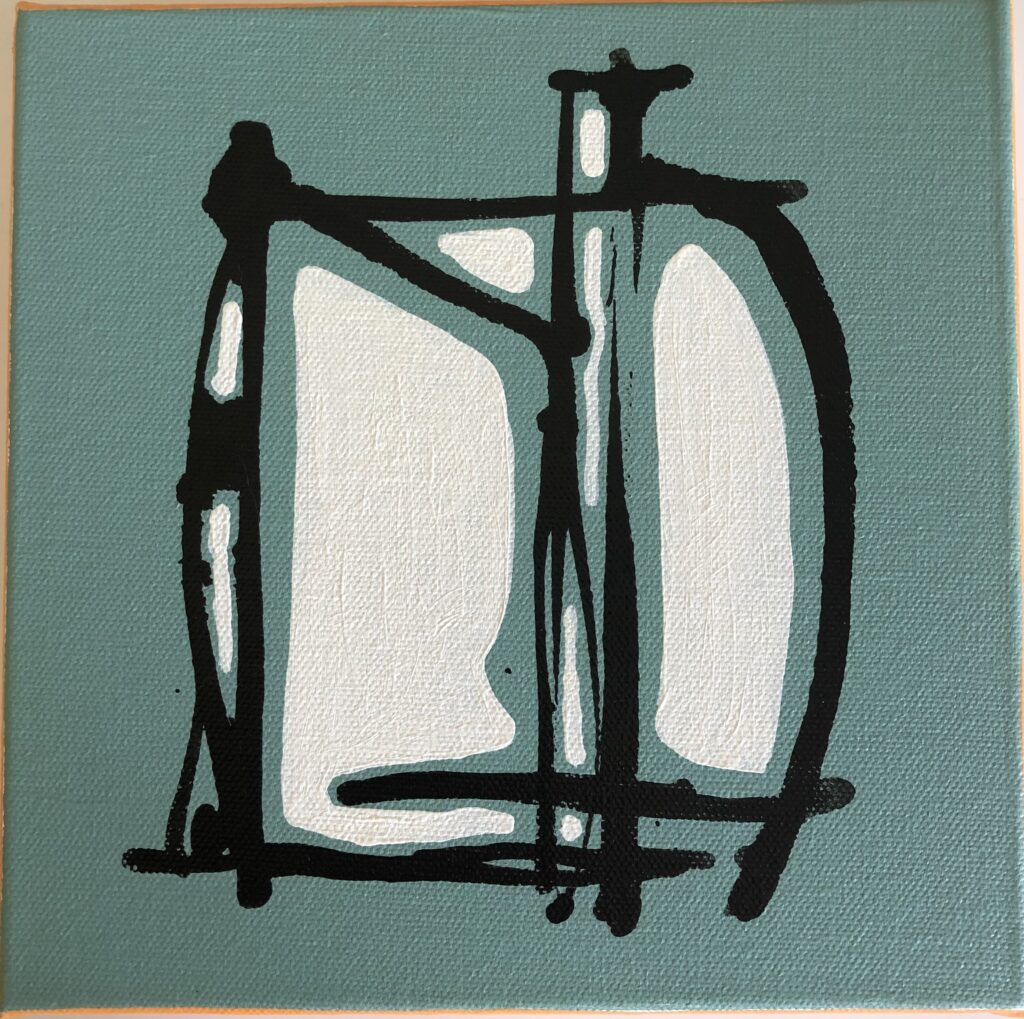
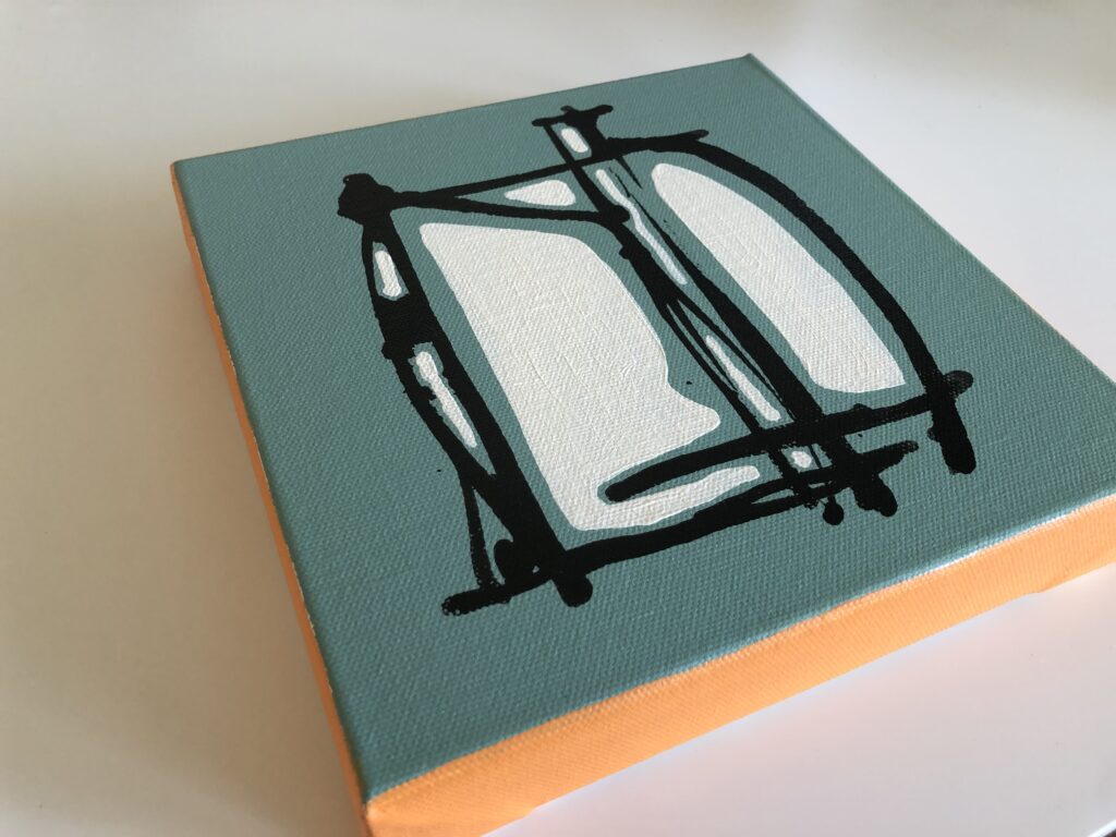
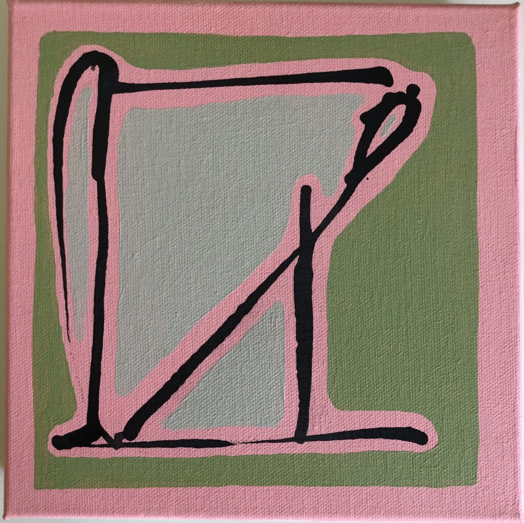
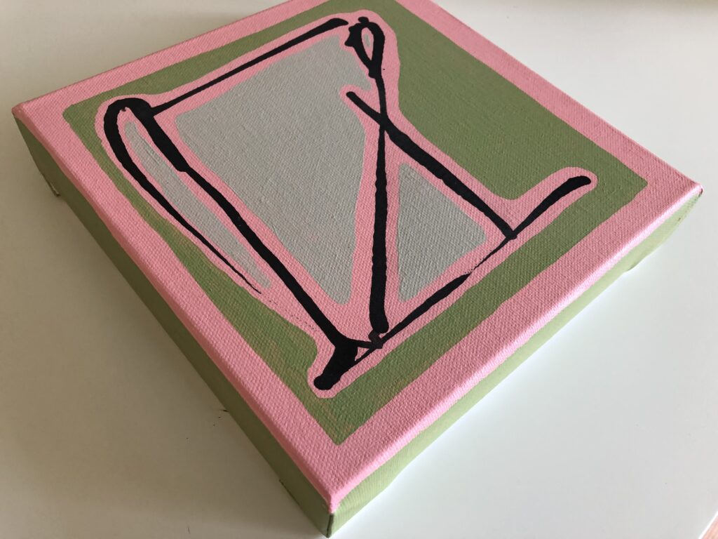
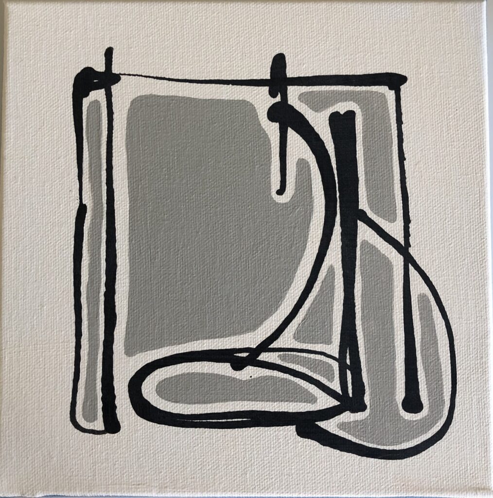
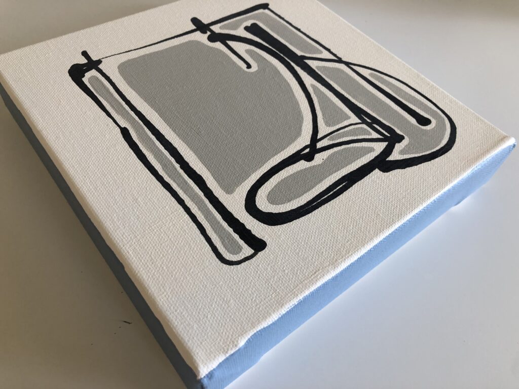
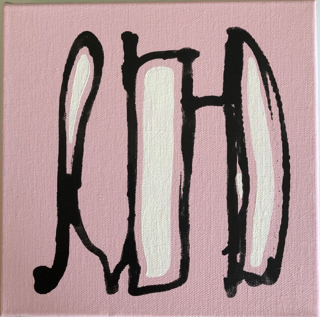
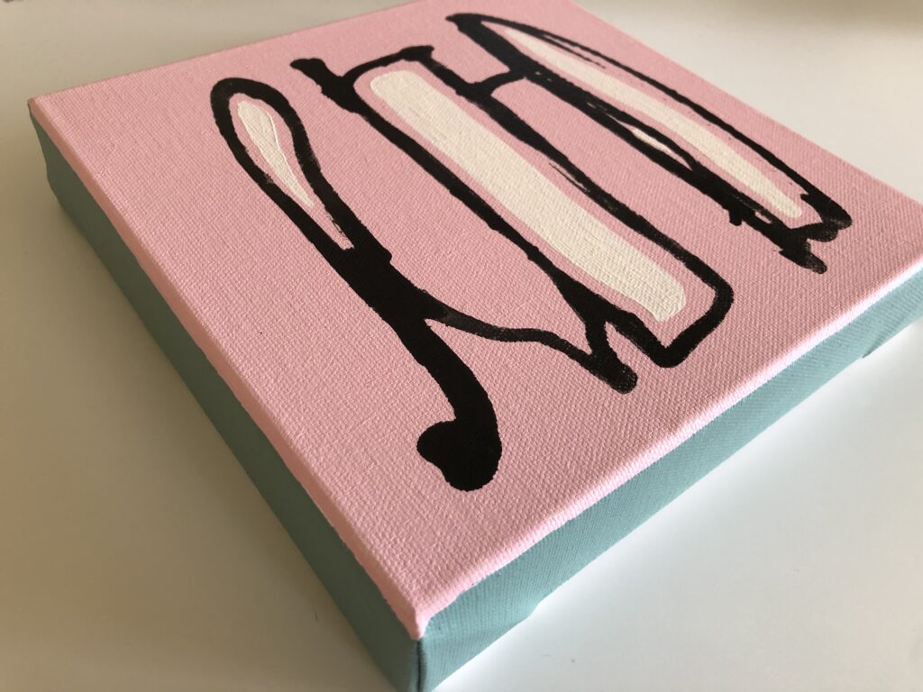
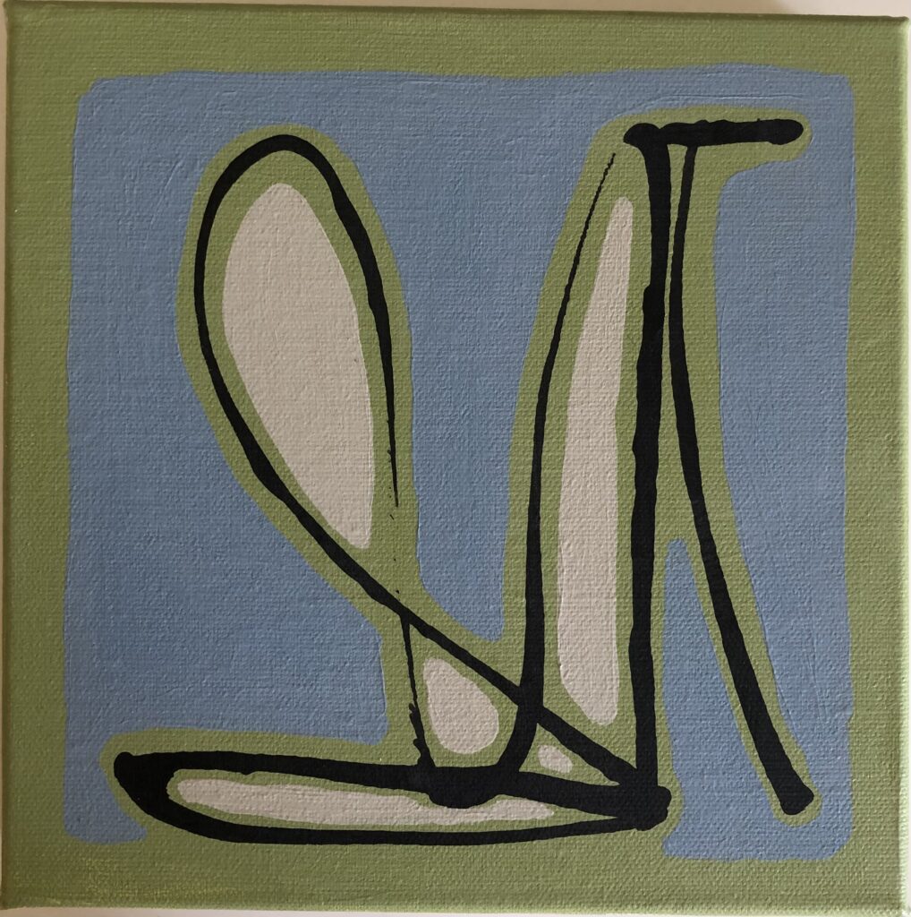
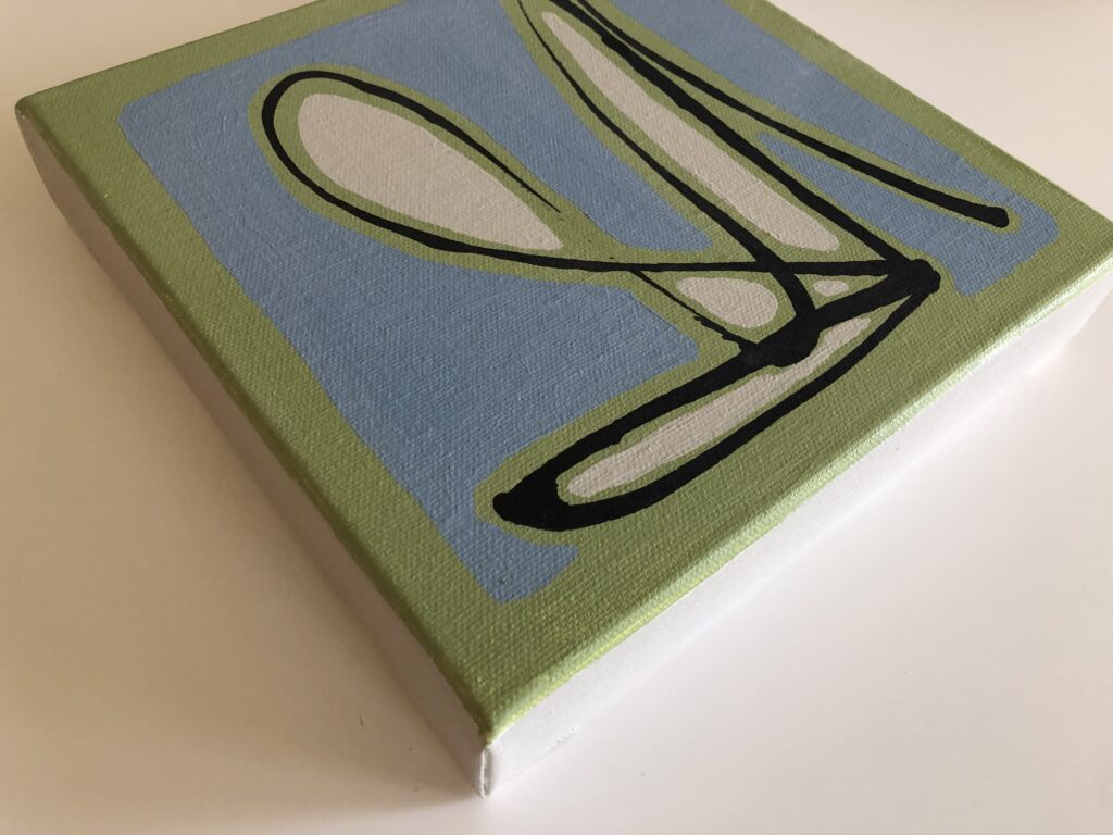
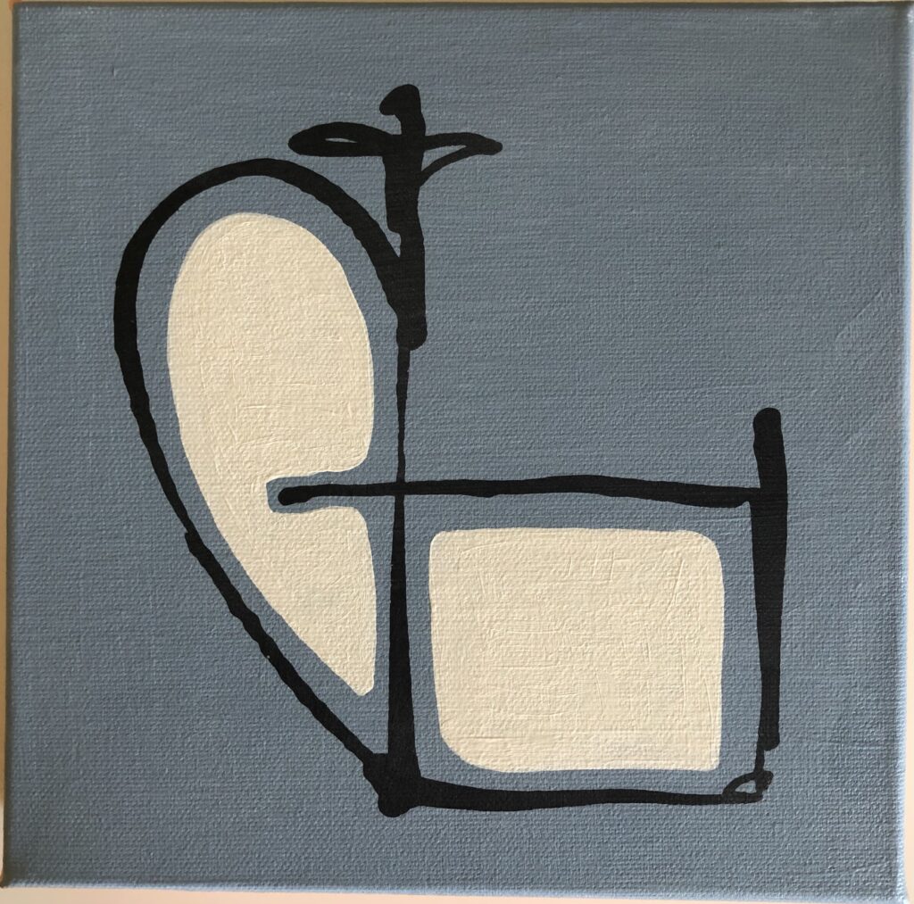
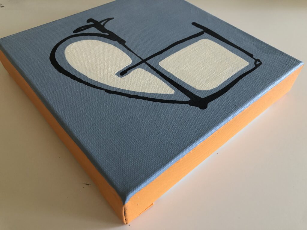
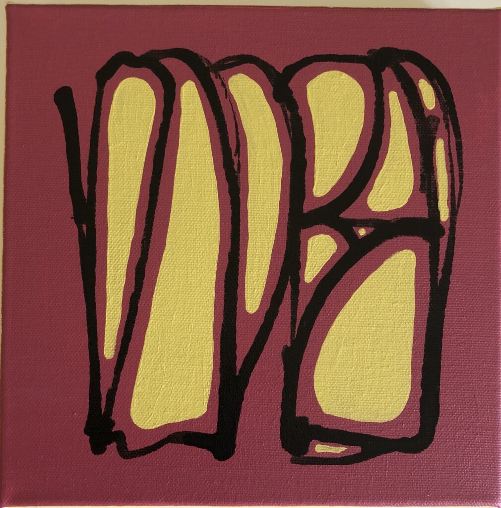
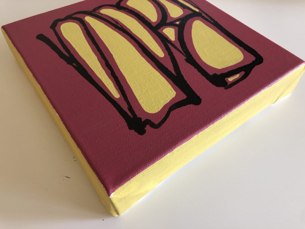
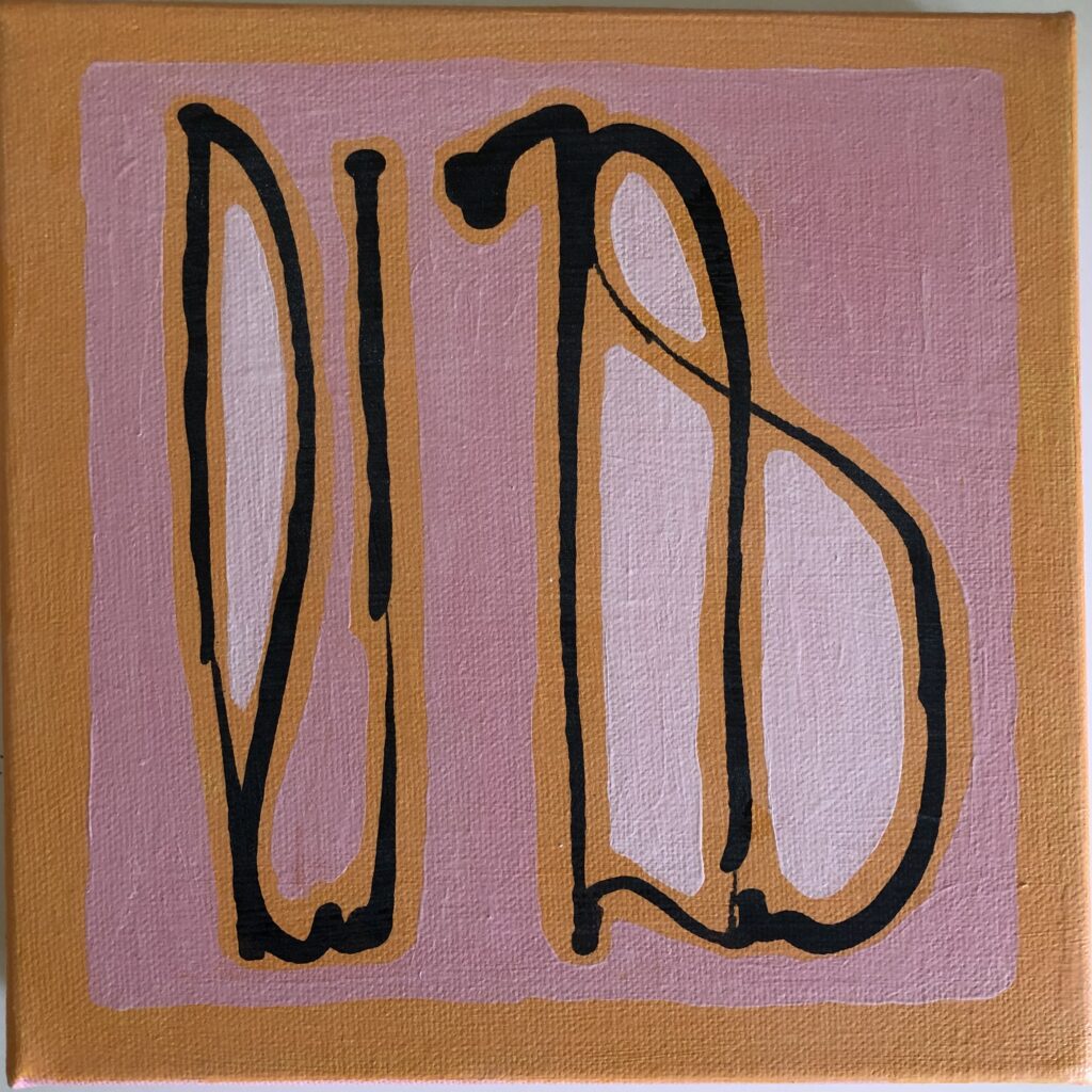
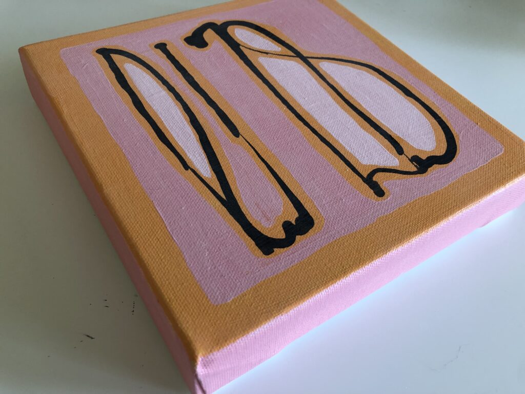
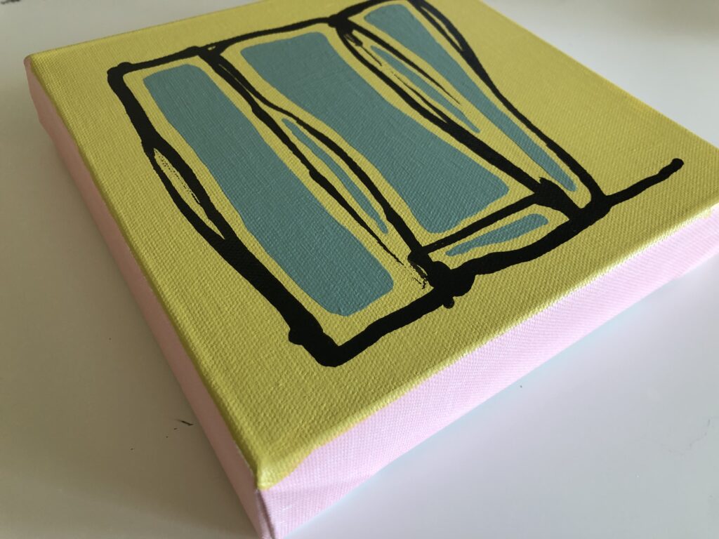
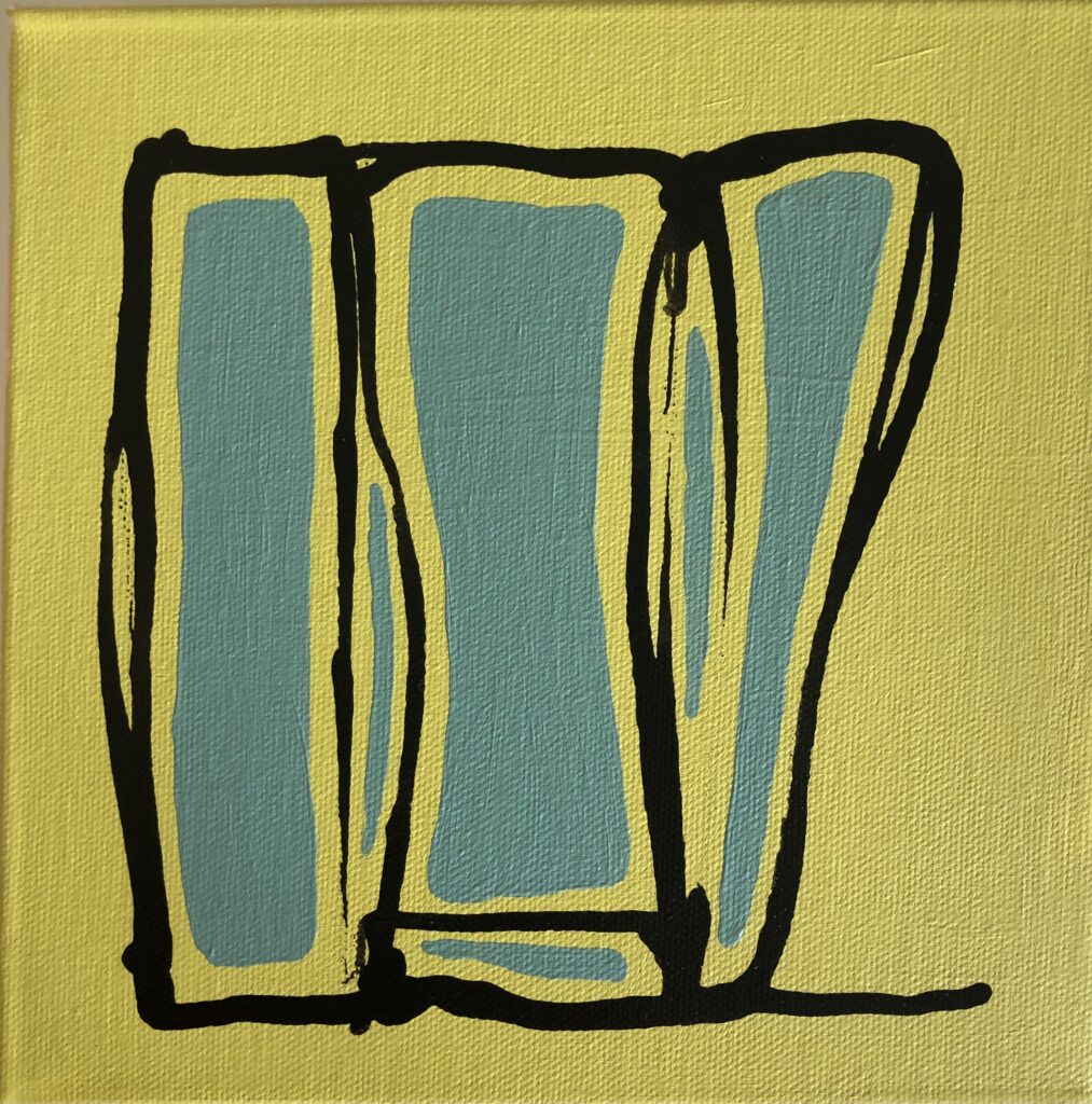
I have some thoughts on these and will probably do more. But another day. So far the series is here.
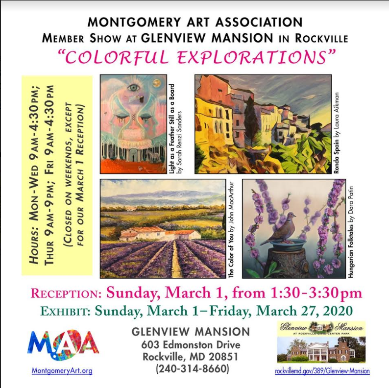
It was great to see all the colorful art at this short-lived show. Almost immediately after the opening night, the pandemic hit. The art stayed up for months and months in a closed building as we all retreated to the safety of our homes. Glenview Mansion remained closed, and eventually all of the exhibited artists did a drive-up pick up of our art… everyone masked and nervous and still so unsure. It was an interesting time, and it continues still, two years later, though with somewhat less fear and a better understanding of how to stay safe and keep others safe around us, but still far fewer public shows. I’m still glad I had the opportunity to show my art at this, my first show, and value the experience, but, oh my that pandemic!